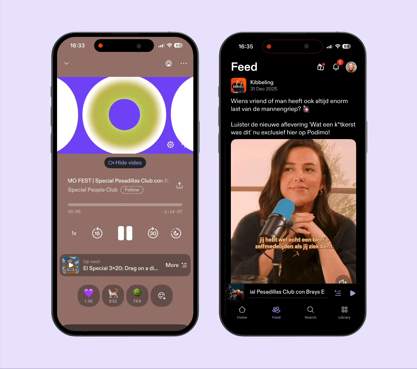
Player redesign
Seamless playback.
Meaningful participation.
MY ROLE
Lead Product Designer
I owned the end-to-end redesign vision across listening, community and discovery.THE CHALLENGE
Too much in one player.
Playback and community competed for attention. The experience needed clarity and room to evolve.MEANINGFUL VIDEO LISTENING
+1.62%
Make room for connection. Keep listening effortless.
Listening controls, the queue and community competed for attention. I redesigned the experience around two mental models: finding episode information and engaging with the show.
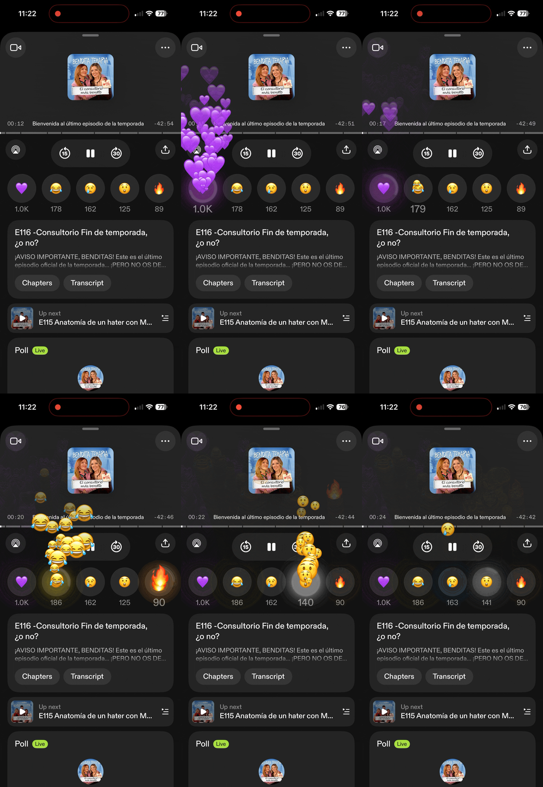
Make participation feel rewarding.
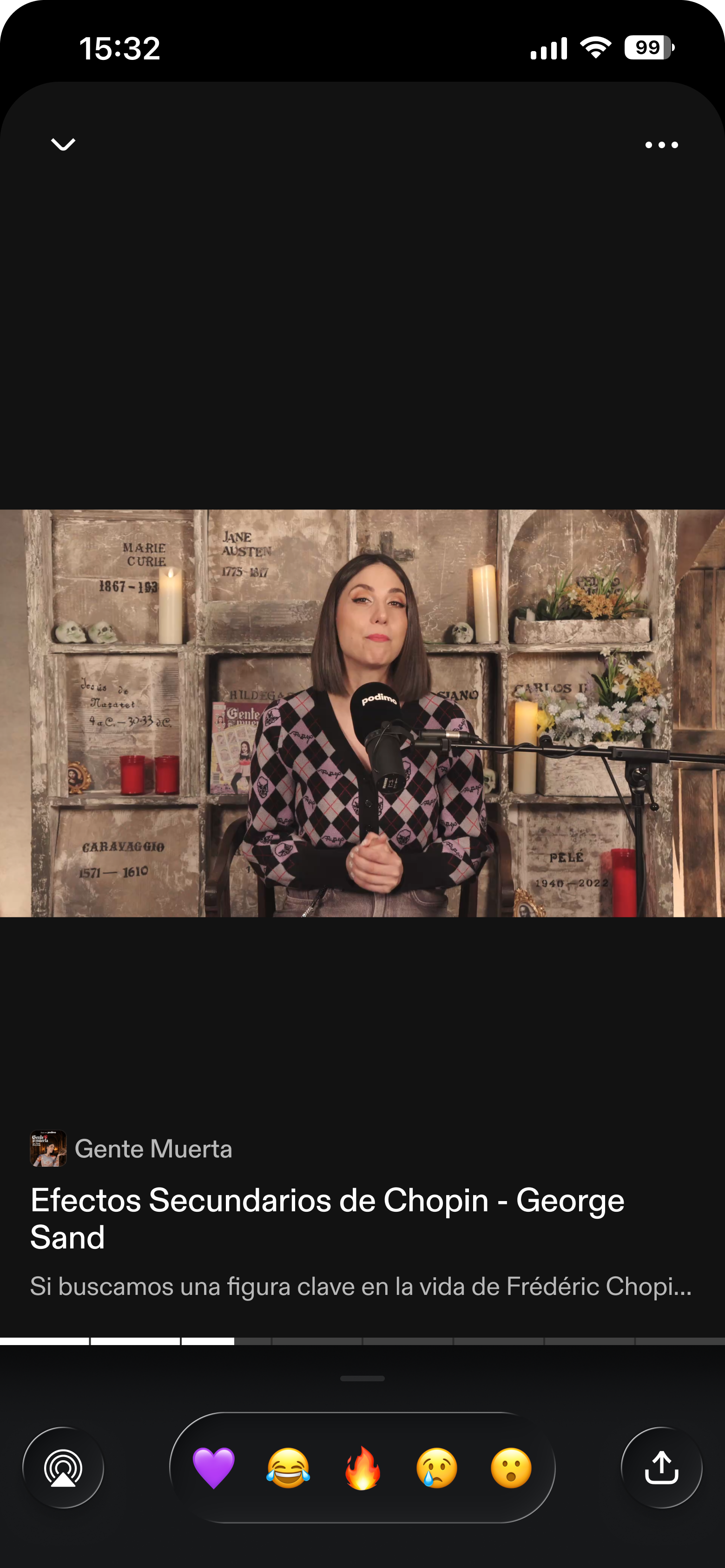
Reactions are the easiest first step into community. I designed a more expressive animation and built it entirely in code, with minimal handover to engineers.
Join the conversation.
Keep the surprise.
Participation should never spoil the episode. I designed a peel-away sticker for spoiler controls in polls and comments, both in the player and episode details. Listeners choose when to reveal discussions that might expose plot points, twists or historical outcomes. The animation keeps community participation playful while protecting the listening experience.
Bring reactions closer to listening.
That same principle extends beyond the player. Making reactions available straight from the Lock Screen increased the number of users who reacted by 123%, with no downside on listening or retention. Removing a small step made participation easier.
The right moment. Not more interruptions.
Context matters more than frequency. Building on that learning, I explored post-episode prompts, smarter poll insertions and Live Activities that surface what’s up next or a title mentioned by the creator, at a relevant point in the journey.
A foundation for being there live.
Real-time interaction is already creating a stronger sense of connection between creators and their audience. Berrum & Beyer, Trash Office, and Emil & Thomas were among the shows that went live within a single month.
From overloaded to intentional.
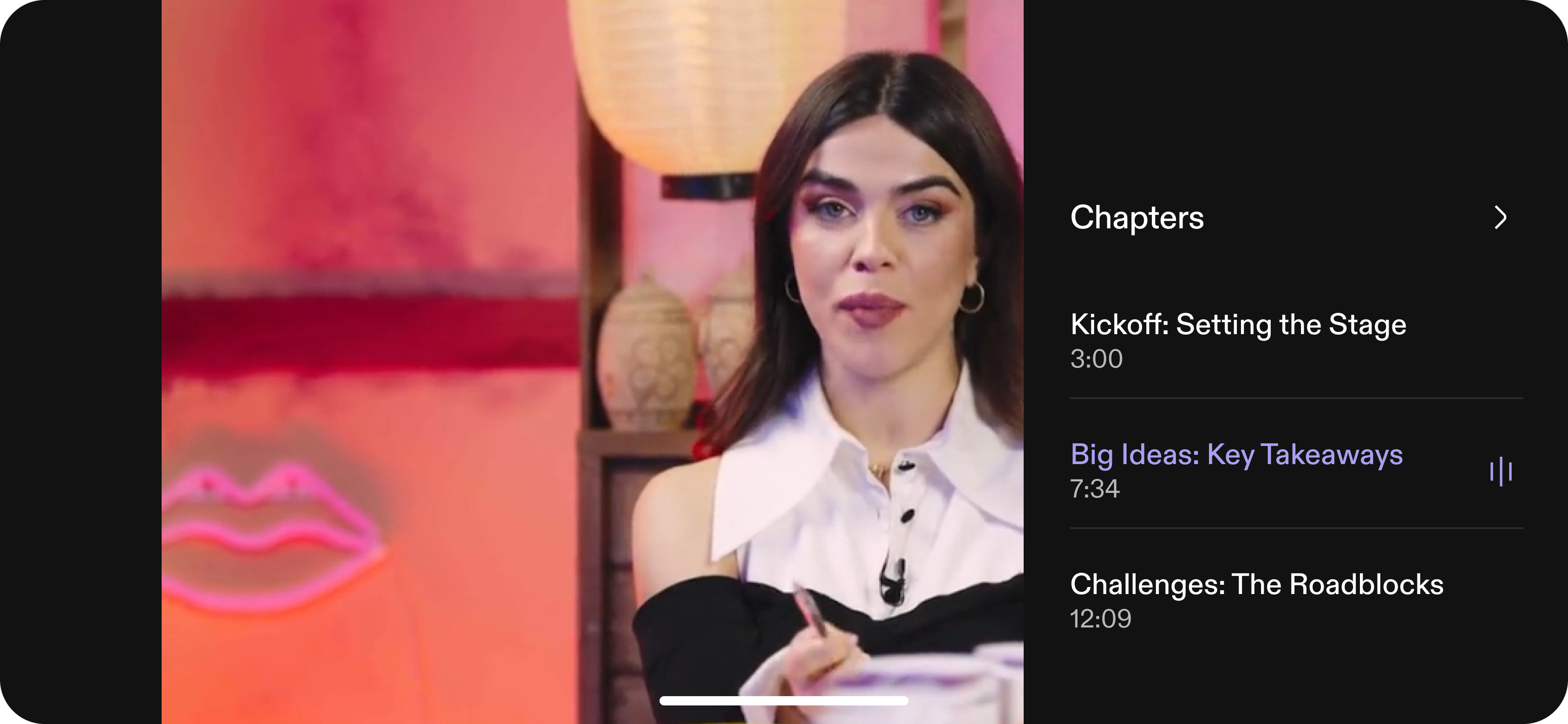
Through user research, I identified two mental models that guided the redesign: information, such as episode details and chapters, and engagement, such as polls, comments and reactions. Separating the two kept community close without interrupting listening.
Before: everything at once.
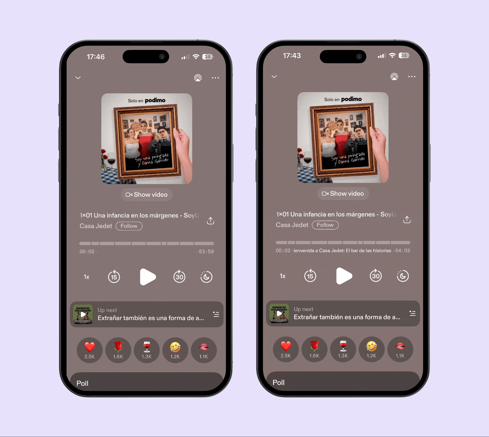
After: room to focus.
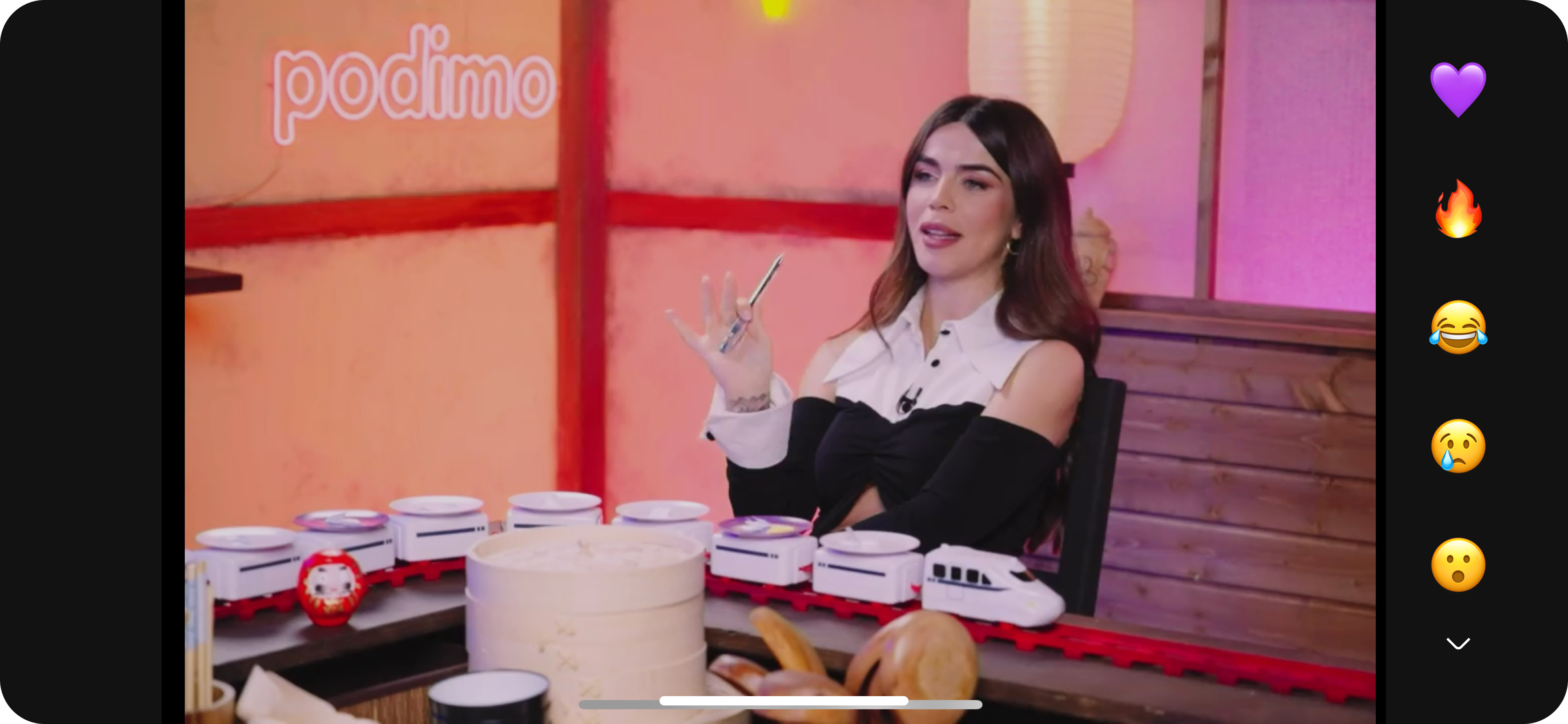
More room to watch.
More ways to connect.
Episode context and creator conversations.
Always close to what’s playing.
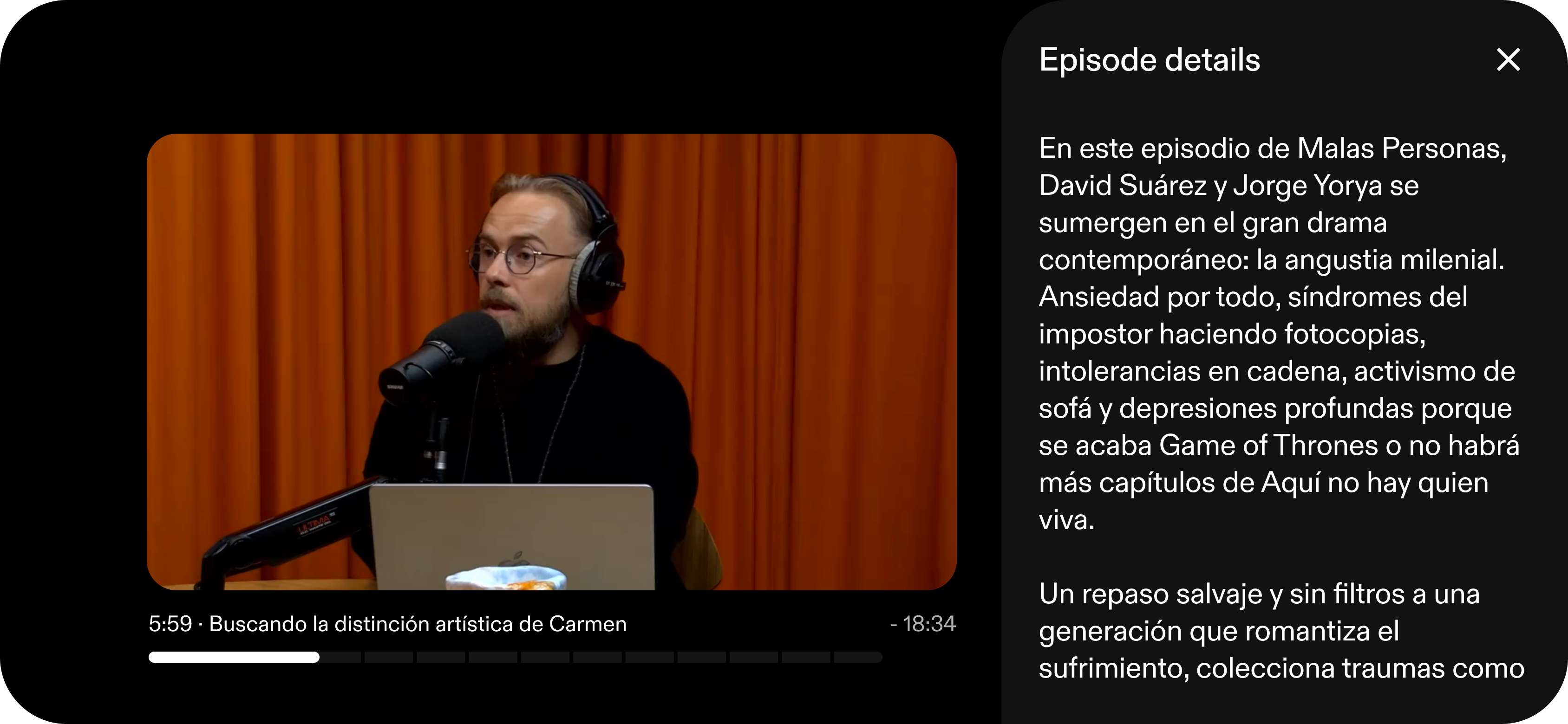
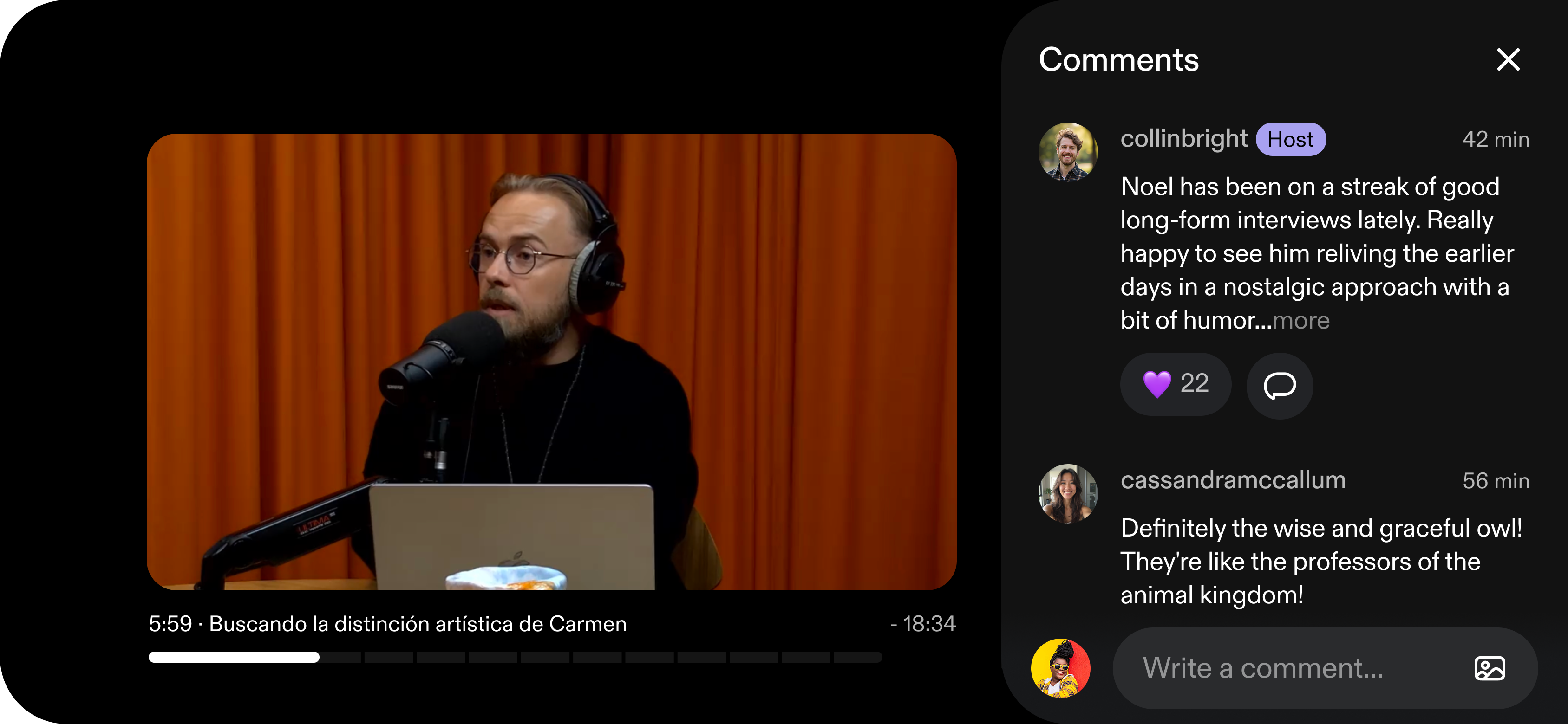
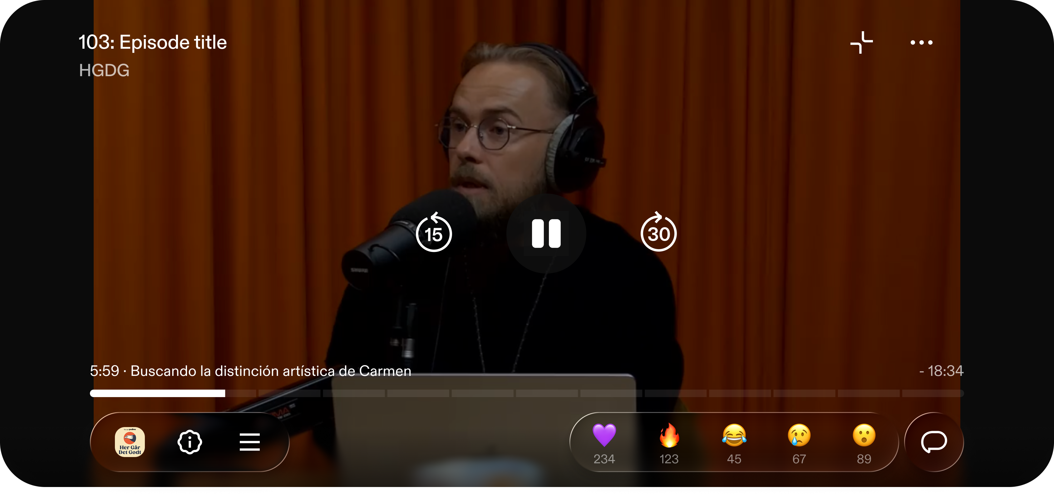
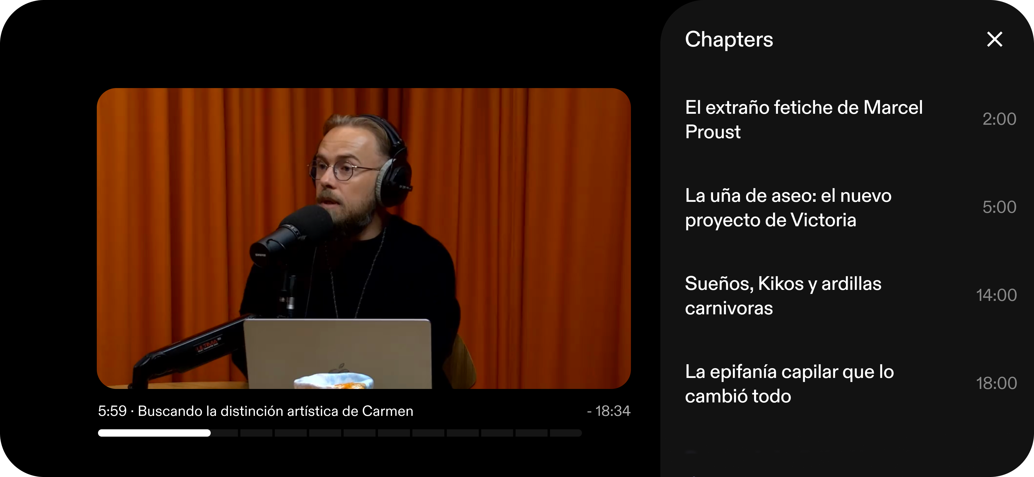
A clearer experience. In landscape, too.
I extended the same structure to landscape: playback and reactions stay within reach, while chapters open in a dedicated panel alongside the video.
A clearer player. Measurable progress.
The first phase tested a more compact player with 1.16 million users. More listeners discovered chapters, transcripts and polls, with a 1.62% increase in meaningful video listening. The reaction and Lock Screen results above show how the wider work also made participation easier.
Chapter list opens
Transcript opens
Poll voting
Users with meaningful video listens