Personalized Home Screen
Boosting engagement and retention in the crucial first week with personalization.
Where did this come from?
User research and competitive analysis revealed a significant gap in our app: the core value and personalization were not effectively presented during onboarding and initial usage. This insight was drawn from examining successful apps like Down Dog, Nike Run Club, Headspace, Spotify, and FYEO.
Enhance user retention by personalizing the Home screen based on users' interests, improving the onboarding experience and driving content engagement.
My role
As one of the main product designers, I focused on the personalization strategy during onboarding. I led the hypothesis formation, user testing, and design iterations as part of a team of three.

Impact & Results
12% increase in week 1 retention over signups
8.6% rise in yearly conversion rate
4% improvement in week 1 retention
How did we get there?
-

1.
Research and Benchmarking:
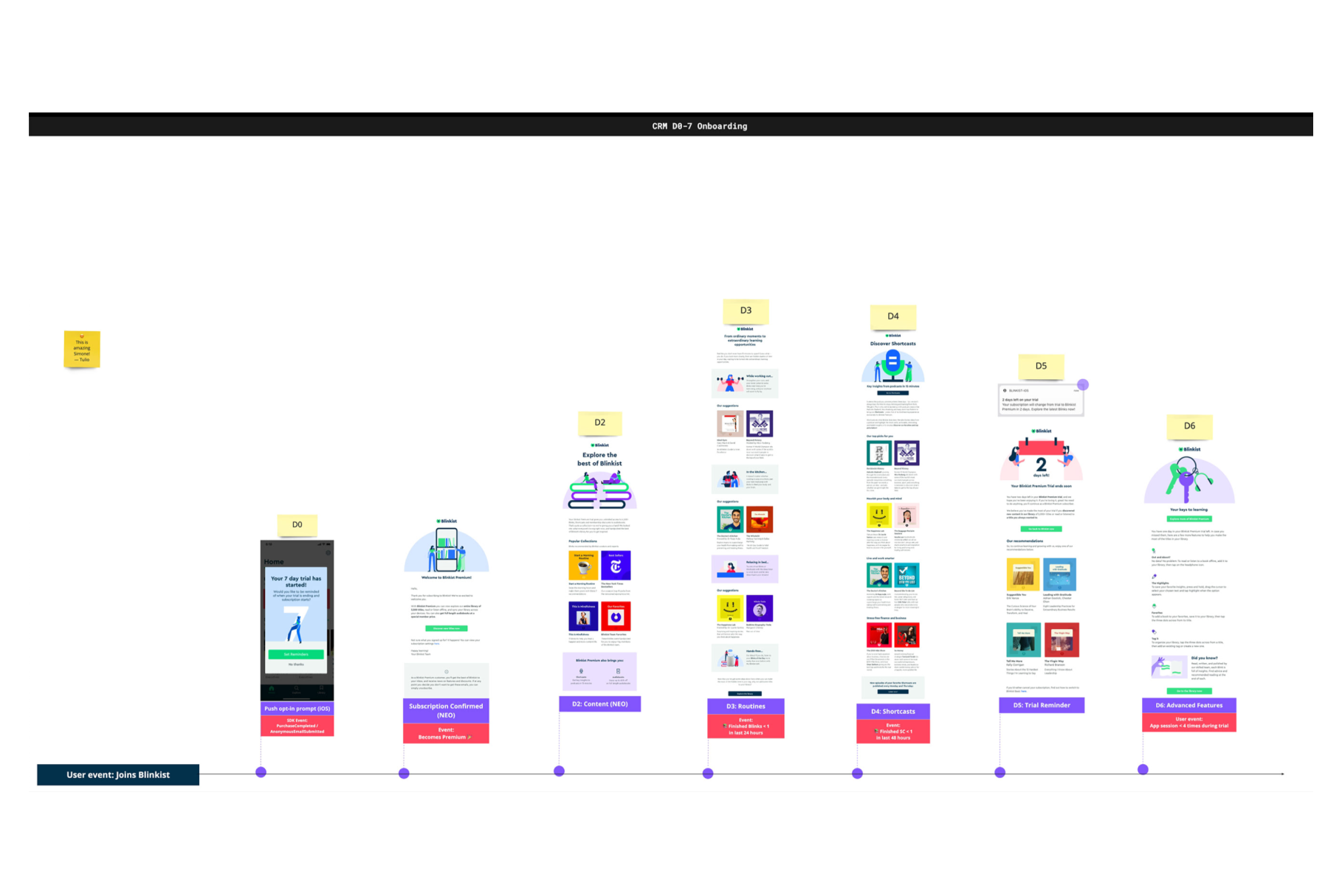
I analyzed successful retention strategies from apps like Down Dog, Nike Run Club, Headspace, Spotify, and FYEO.
-
2.
Hypothesis Formation:
I identified a lack of presence of our core value in both our app and email flow and we thought that a personalized Home screen would improve user engagement.
Our hypothesis was that customizing the Home screen with pre-selected categories from onboarding would increase week 1 retention, boost content interaction on D0 and enhance content consumption on D1.
We've conducted a series of usability and A/B testing to validate this, resulting in an 8% increase in conversion rate and a 9% rise in trial opt-ins.
The new default personalized screen was implemented, reflecting the user's chosen categories.
3.
Next steps & first results
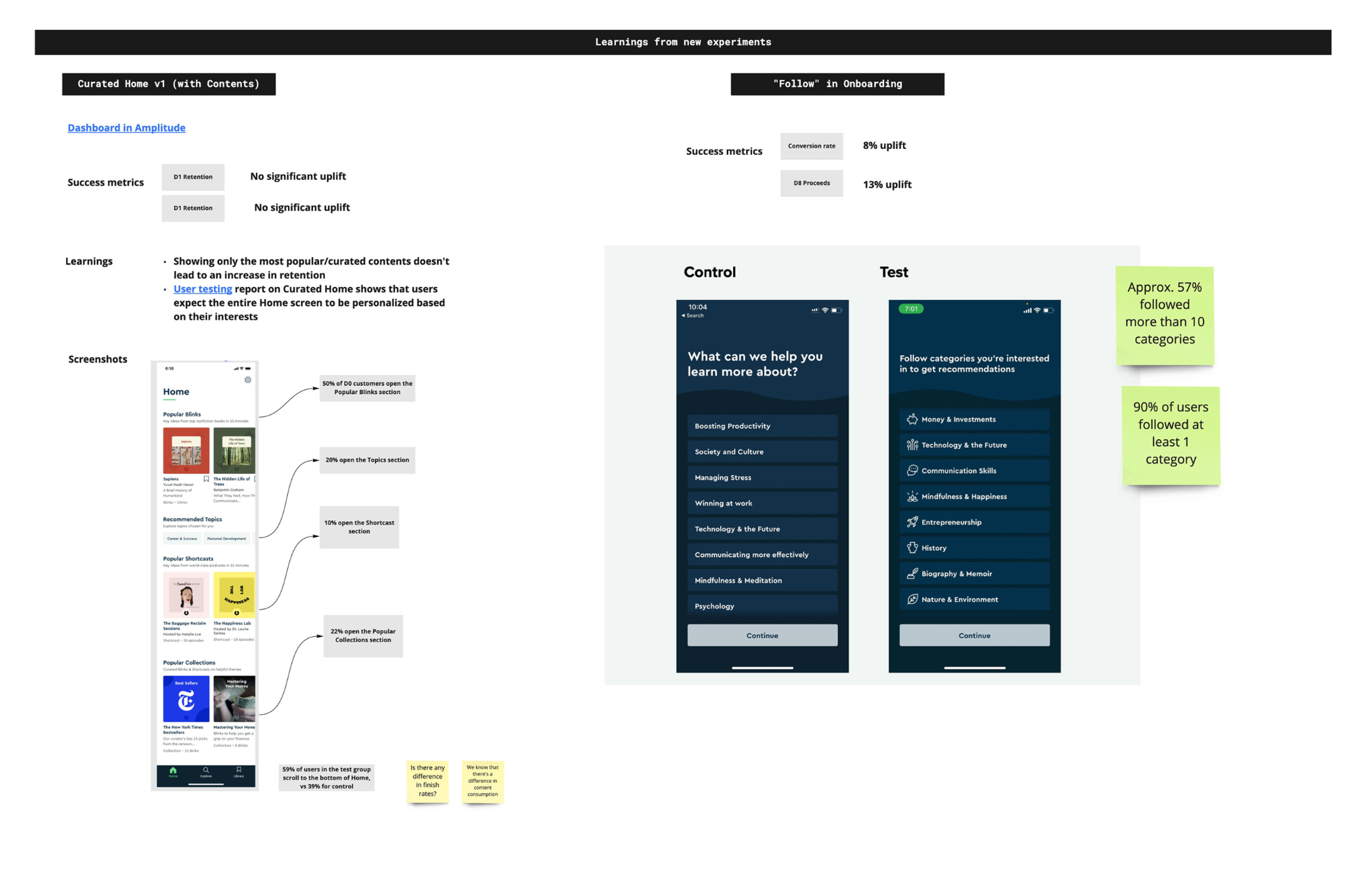
1. My teammates and I led a design initiative focused on a "Follow" based discovery project to inspire users with relevant recommendations. We reorganized content, moving Trending and Latest to the Explore screen, and renamed Home to "For You" for personalized recommendations.
2. User testing validated our new Information Architecture, showing a clear separation between personalized recommendations and content discovery. This refinement enhanced user understanding and engagement, leading to more effective personalization.
Design decisions
1. An updated content distribution
In the second phase of our project, aimed at inspiring users through relevant recommendations, fellow product designers—Justyna, Tulio, and myself—led a design initiative centered around a "Follow" based discovery project.
We proposed an Information Architecture change, advocating for the renaming of the Home to "For You," serving as a hub for personalized recommendations based on explicit user follows.

2. Adapt to users’ mental models
In preparation for user testing, each designer created wireframes aligning with their solution.
From the insights of the first test, I’ve identified a clear separation between:
• Home: recommendations for me
• Explore: discover content with us
I used the following mental model and content separation:
I control vs Blinkist does the work for me.

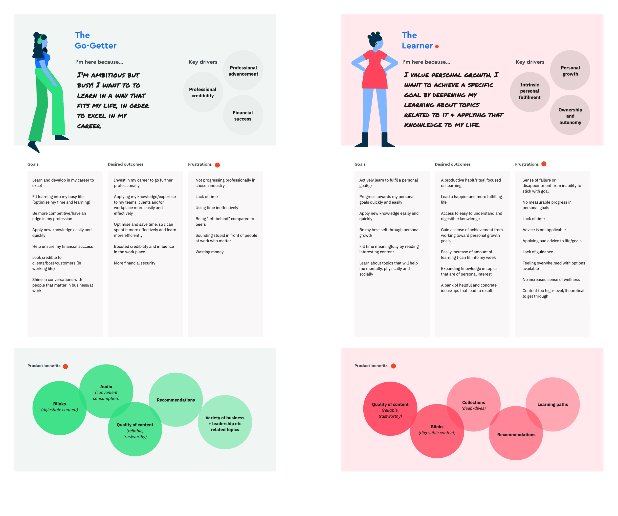
3. Leverage Proto Customer Profiles
My model used proto customer profiles to map key drivers and product benefits based on onboarding selections. BI decided to pair these profiles with data to gather more detailed information about user interests, feeding the algorithm for enhanced personalization.
The goal was to use data-driven insights to personalize user experiences further.
Outcome & results
We learned that
Users had a clear understanding of the IA model and the distinct purposes of the "For You" and "Explore" screens.
The connection between onboarding choices and displayed content was evident to users.
They appreciated the control over customizing their interests and managing content.
The personalized Home screen initiative resulted in a significant improvement in key metrics.
The new For You screen with my proposal, IA change and personalization was rolled out to new users.
We planned to evolve the "For You" logic by introducing taste breakers and leveraging ongoing segmentation projects to further enhance personalization based on diverse user behaviors and preferences.
A Personalized Experience
Before
The Home screen was static, lacking reflection of user-selected interests from onboarding.

After
The Home screen, renamed "For You," dynamically displays content based on categories chosen during onboarding, with a pinned "categories you follow" section for easy management.
